
.jpg)
OVERVIEW.
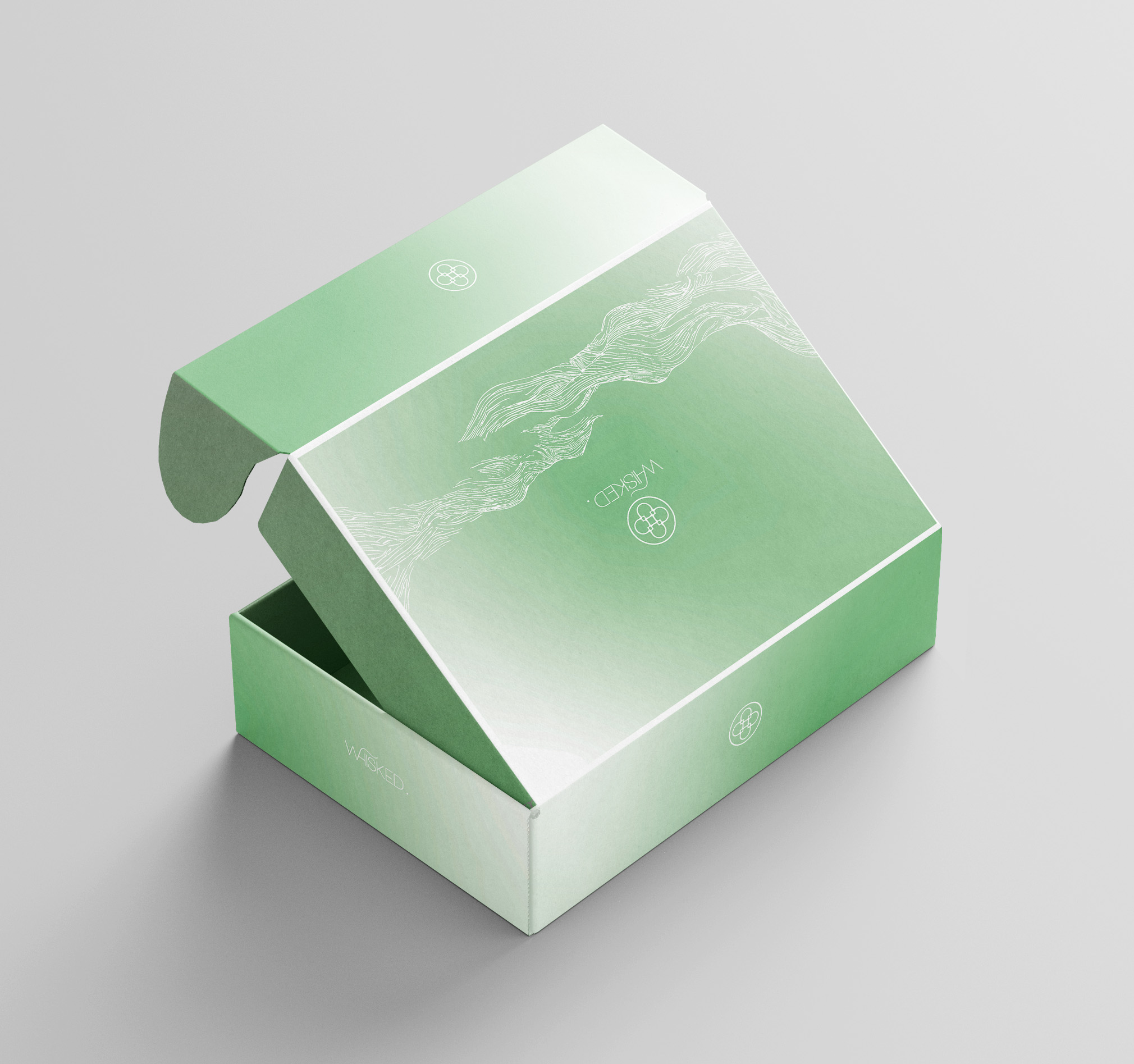
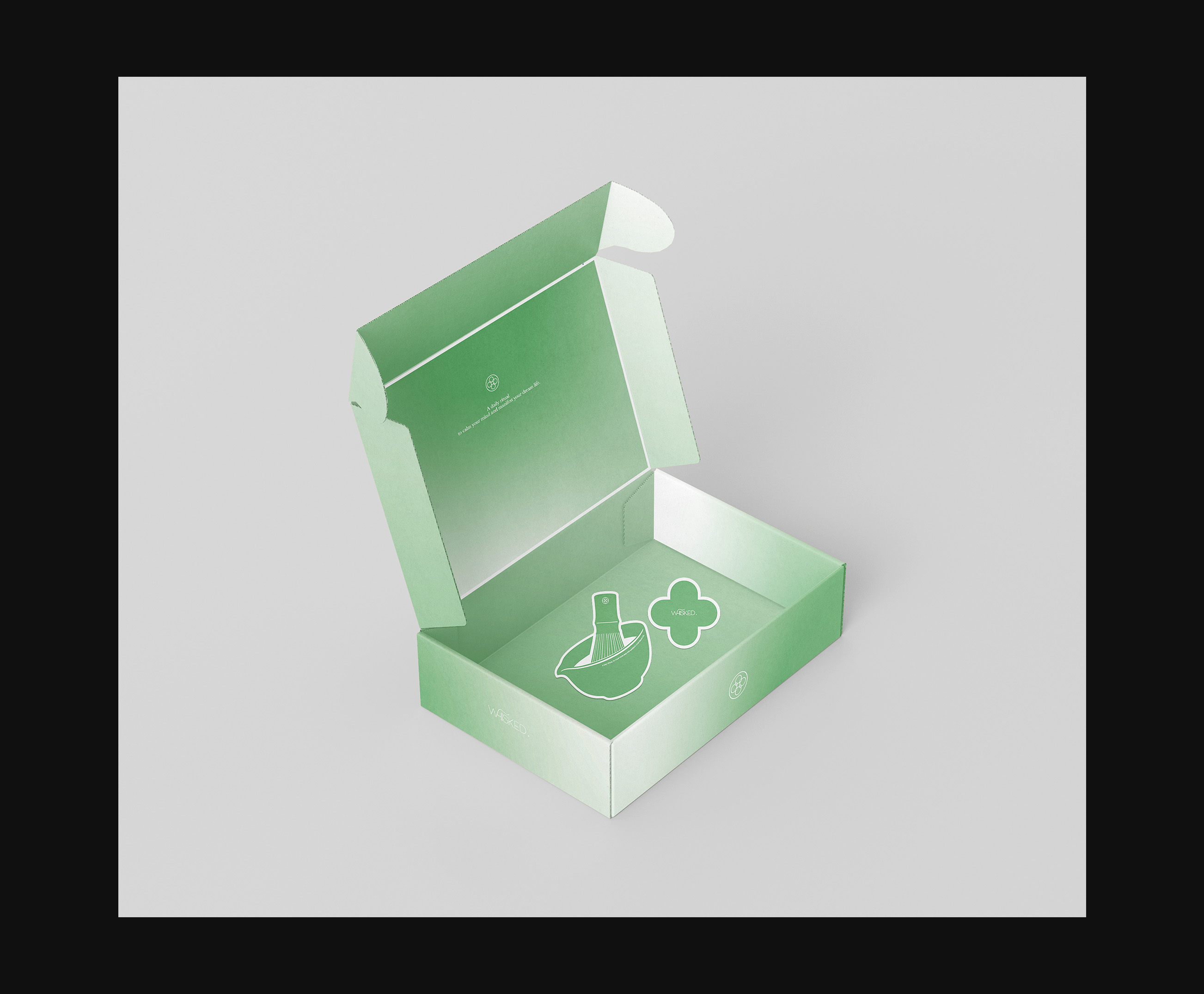
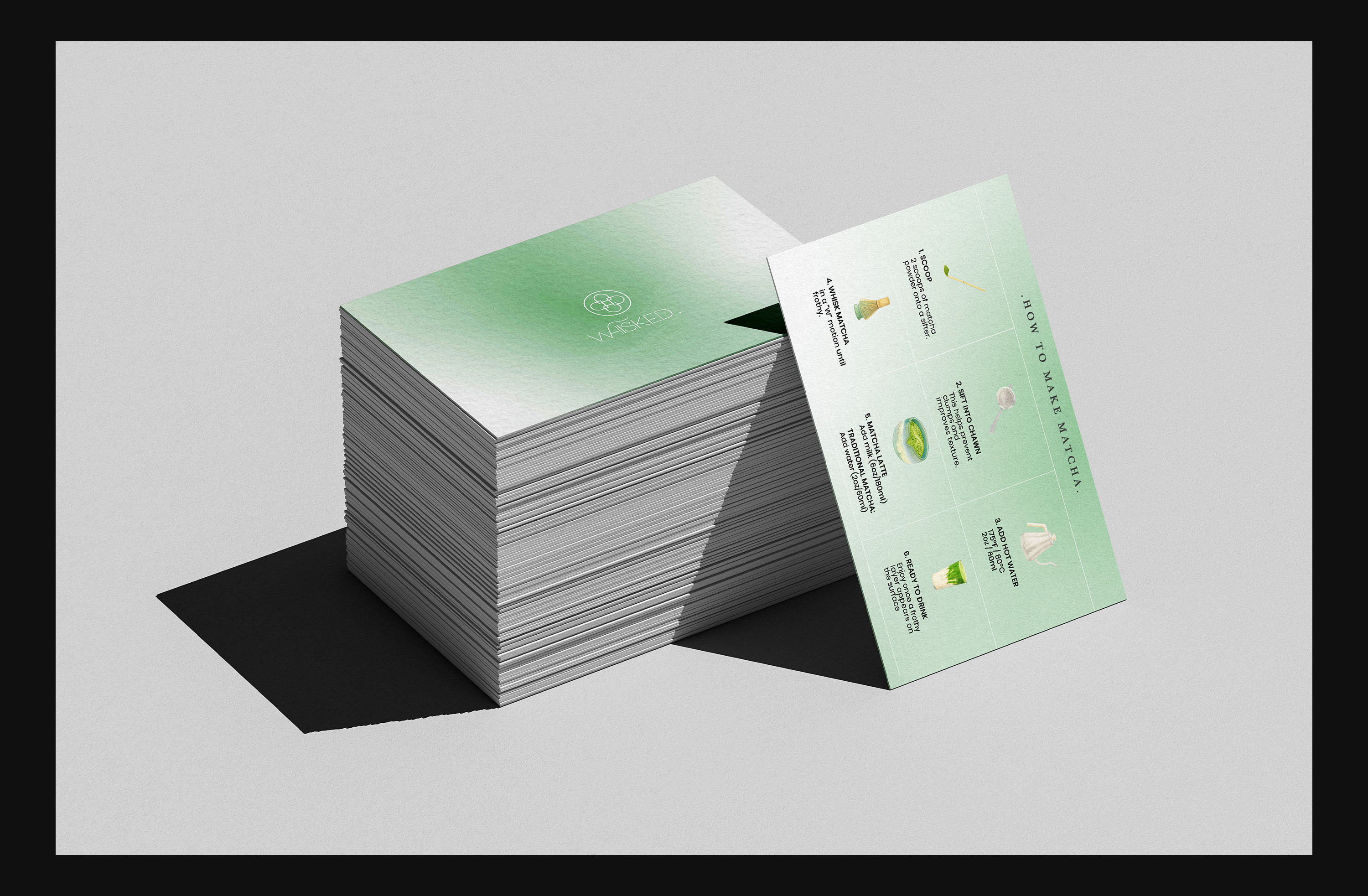
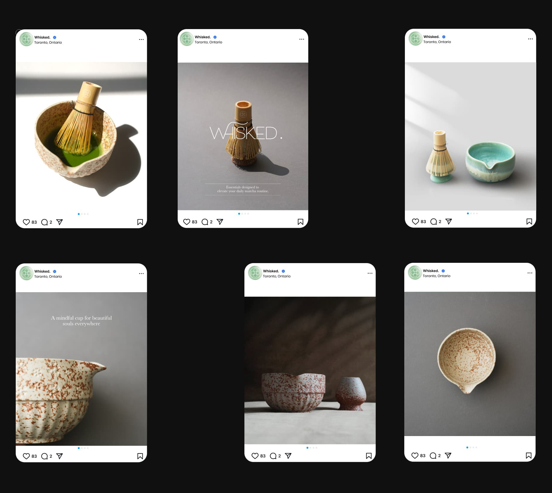
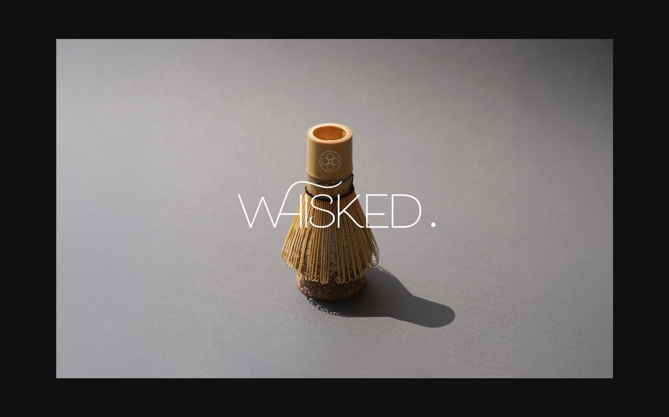
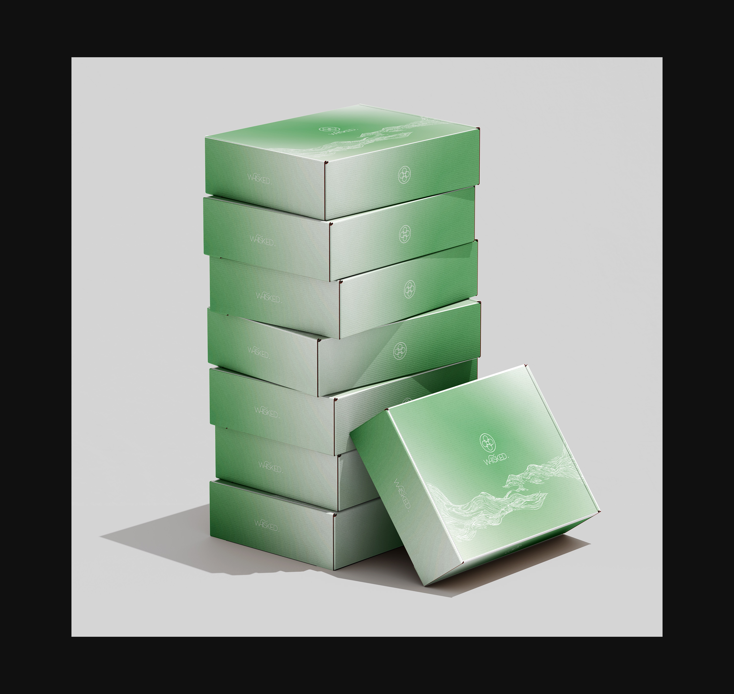
WHISKED. is a wellness-focused matcha brand built around daily ritual, calm, and mindful living. This project involved a full rebranding, including a new visual identity and gift-style packaging for two 5-piece Matcha Whisk Sets, along with a seasonal edition and supporting materials. I Inspired by Japanese aesthetics and the symbolism of Mount Fuji, I used soft neutral colors, clean layouts, and subtle details to create a calm and premium unboxing experience that reflects the brand’s philosophy.

PROCESS.
The process began with researching the matcha and wellness category to understand how premium brands position themselves through packaging and branding. This helped identify opportunities to create a more distinctive and emotionally driven identity within a crowded market.
I then explored Japanese aesthetics and the symbolism of Mount Fuji to define the brand direction. This informed mood boards focused on calm, minimal design, soft neutral colours, and a sense of ritual and balance.
These insights were developed into a cohesive branding and packaging system for WHISKED., focusing on a considered unboxing experience that reflects the brand’s wellness philosophy and sense of ritual.