

OVERVIEW.
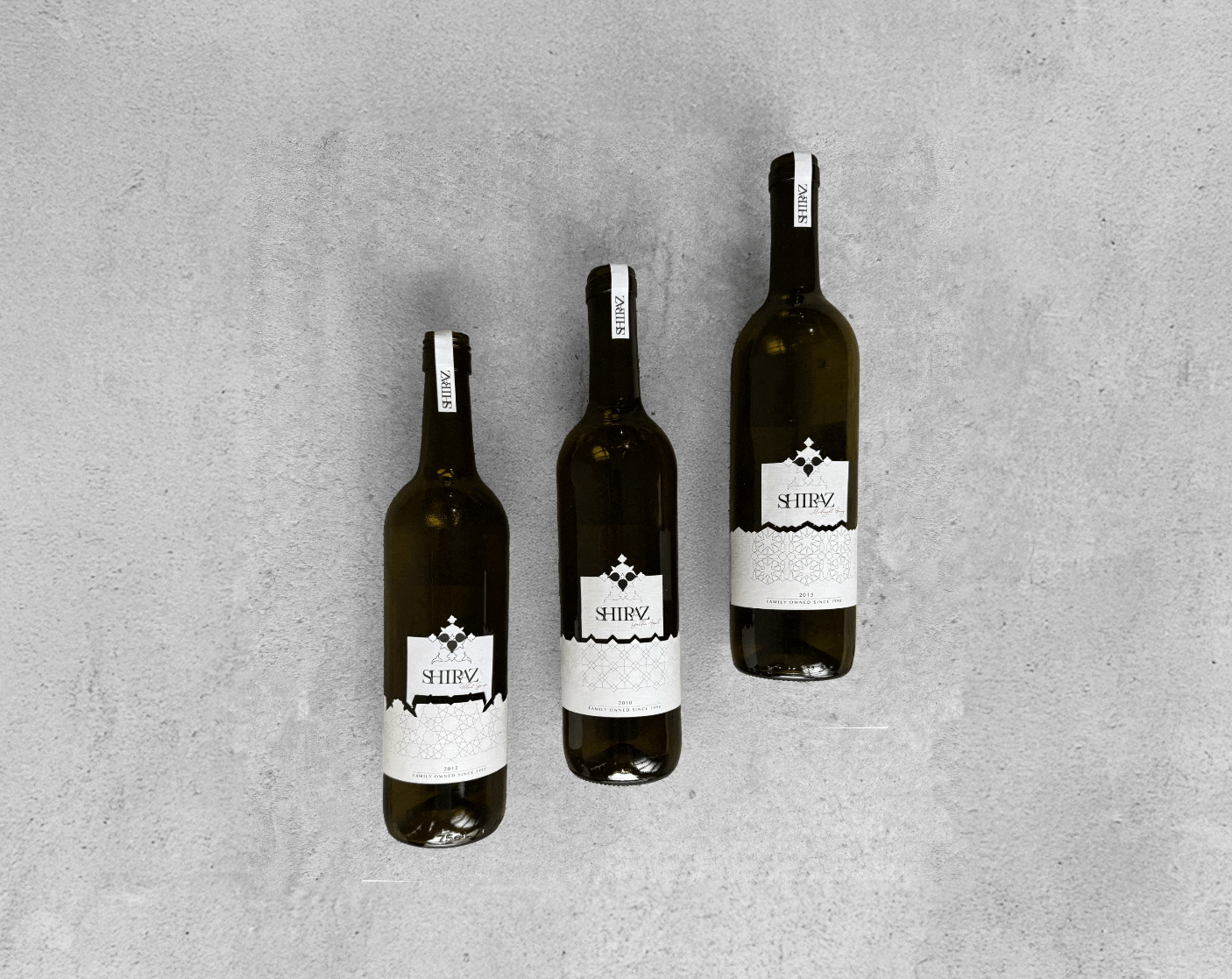
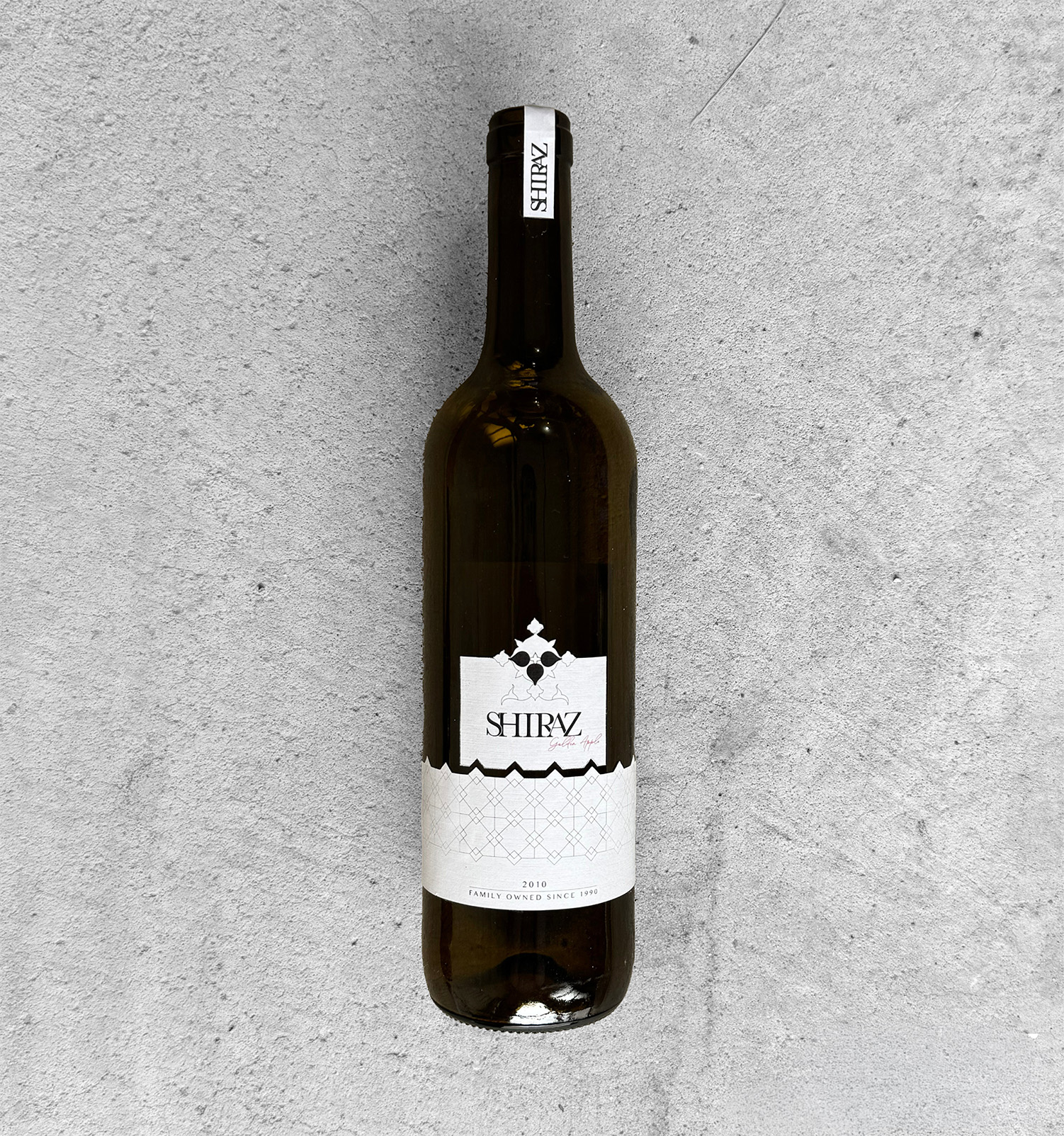
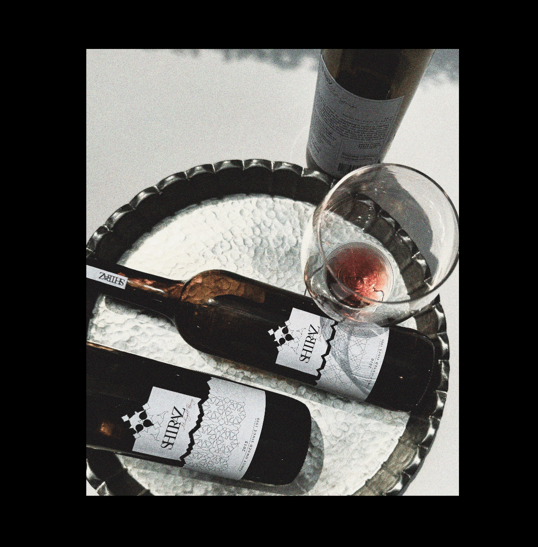
Shiraz is a modern Canadian wine brand that combines cultural heritage with a clean, contemporary design. The brand focuses on creating a refined and delicate experience where each bottle represents more than just wine it reflects mood, emotion, and personal moments.

PROCESS.
The goal of the Shiraz project is to create a distinctive and elegant brand identity that positions the wine as a modern, premium product within the Canadian market. The design aims to communicate quality, refinement, and cultural depth while appealing to contemporary consumers.
The main challenge was to differentiate the product in a highly competitive wine market, where many brands rely on traditional or overly decorative packaging. This project addresses that problem by using a minimal design approach combined with subtle cultural patterns inspired by Shiraz City, creating a unique balance of modern simplicity and heritage.
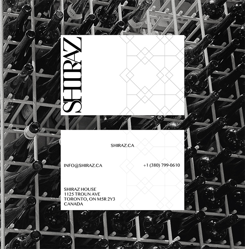
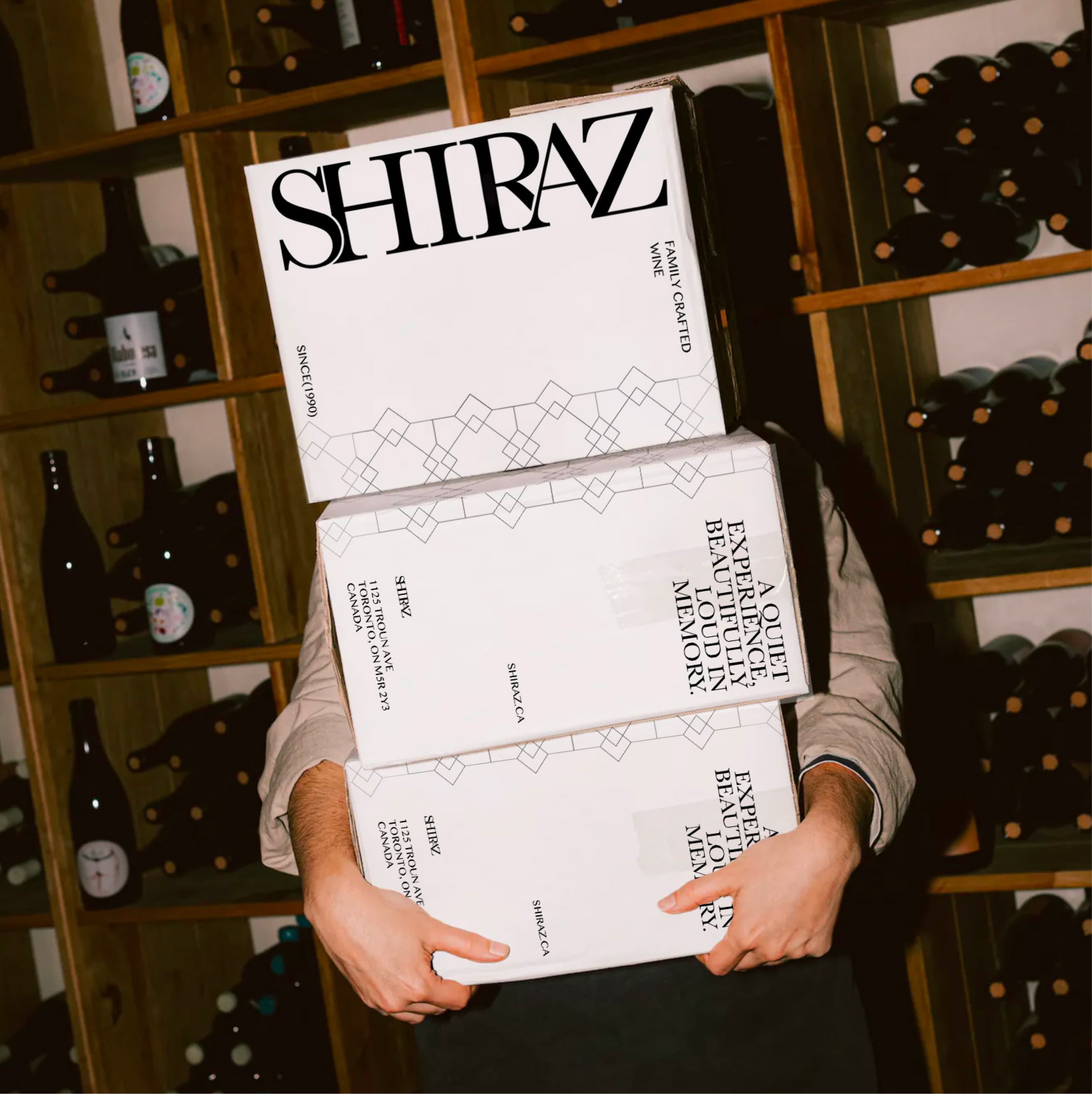
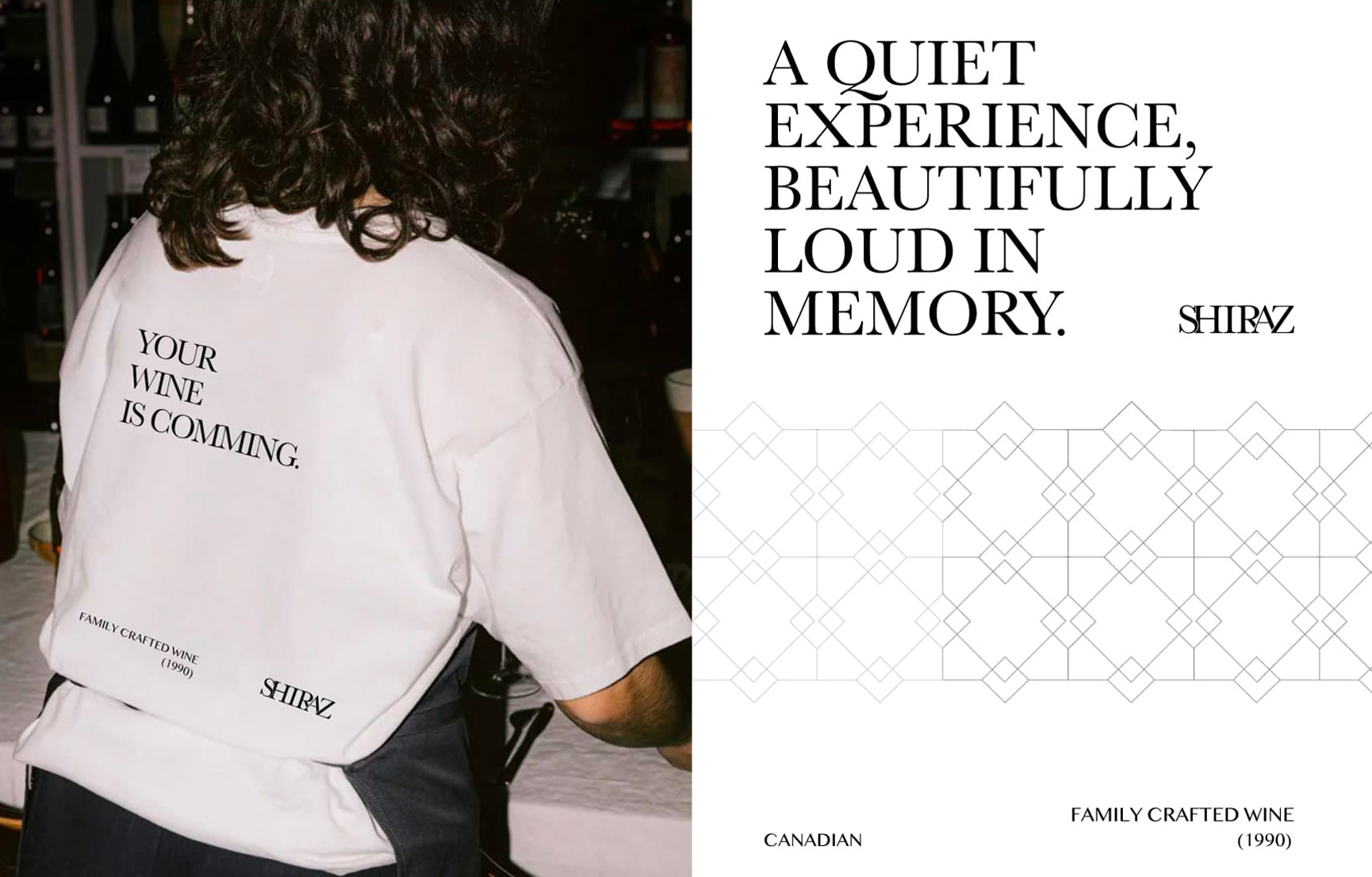
I focused on incorporating cultural patterns inspired by Shiraz City to add depth and a sense of heritage while maintaining a contemporary feel. A black-and-white palette with a subtle red accent, along with tone-on-tone Persian geometric patterns, creates a refined and distinctive visual language. This approach helps elevate the perceived quality of the product and builds a stronger emotional connection through cultural storytelling. By combining modern simplicity with heritage, the design responds to today’s market, where consumers are attracted to brands that feel authentic, clear, and visually sophisticated.


fragRance.
The Shiraz Fragrance Collection expands the brand into fine perfumes inspired by the city’s heritage and its spring atmosphere of blooming flowers. The project includes brand extension and packaging design for a range of scents that reflect different moods, translating the sensory spirit of Shiraz into a modern experience.

.jpg)

