
OVERVIEW.
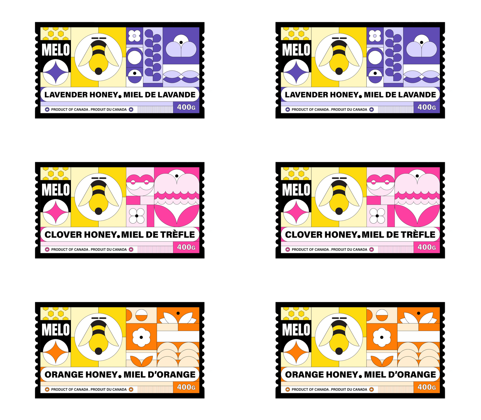
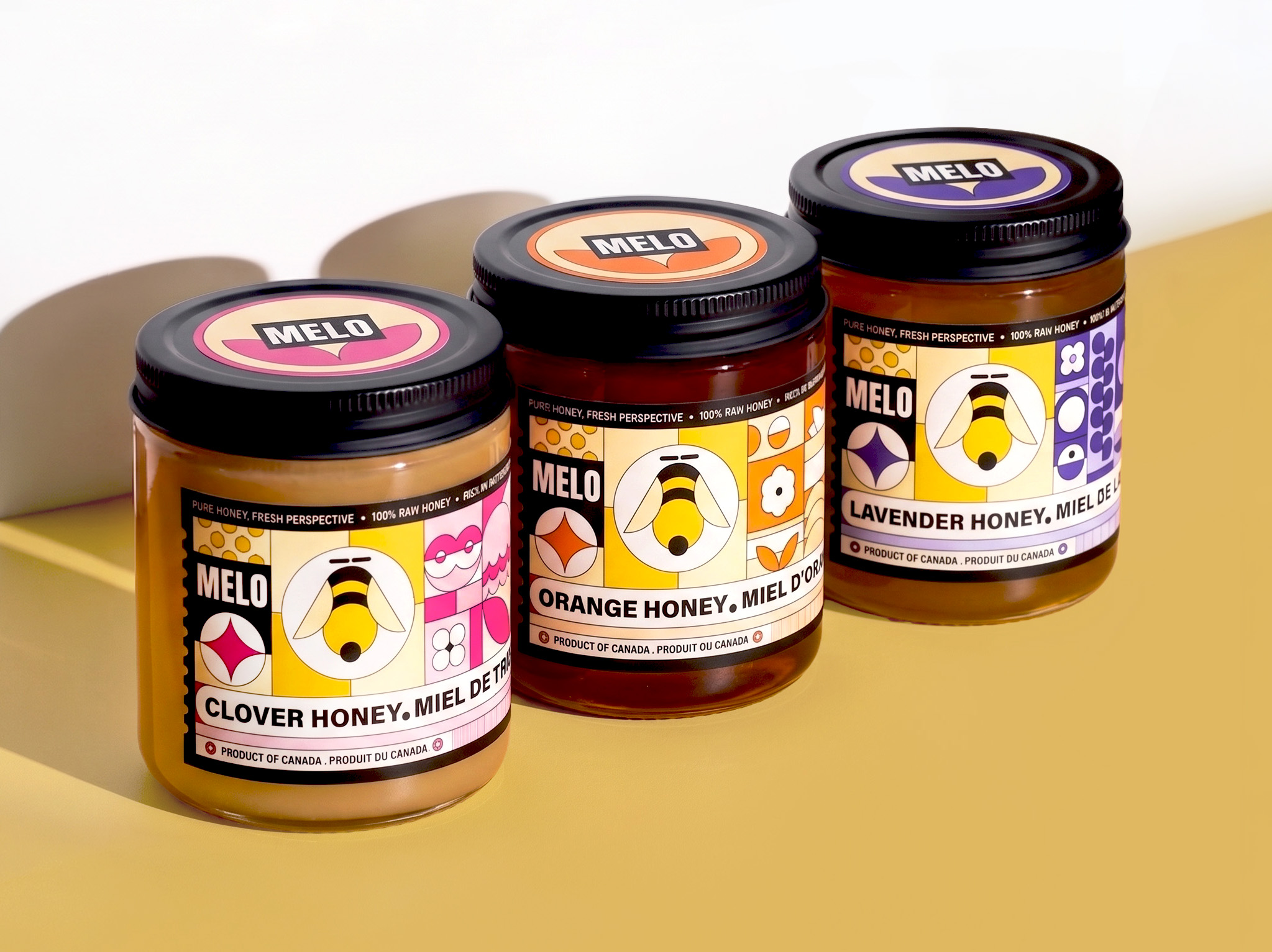
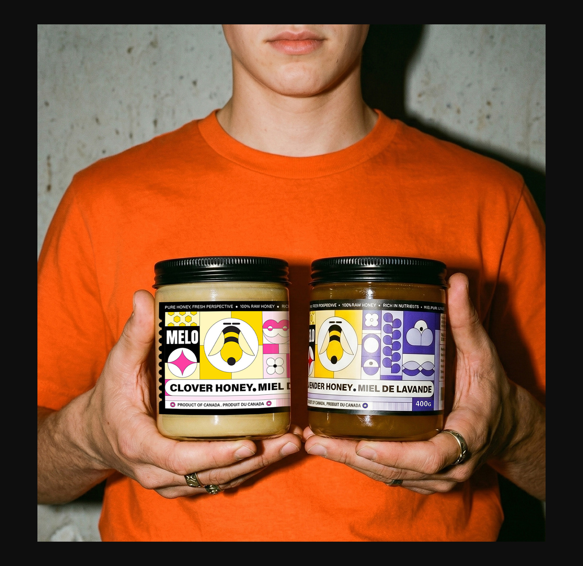
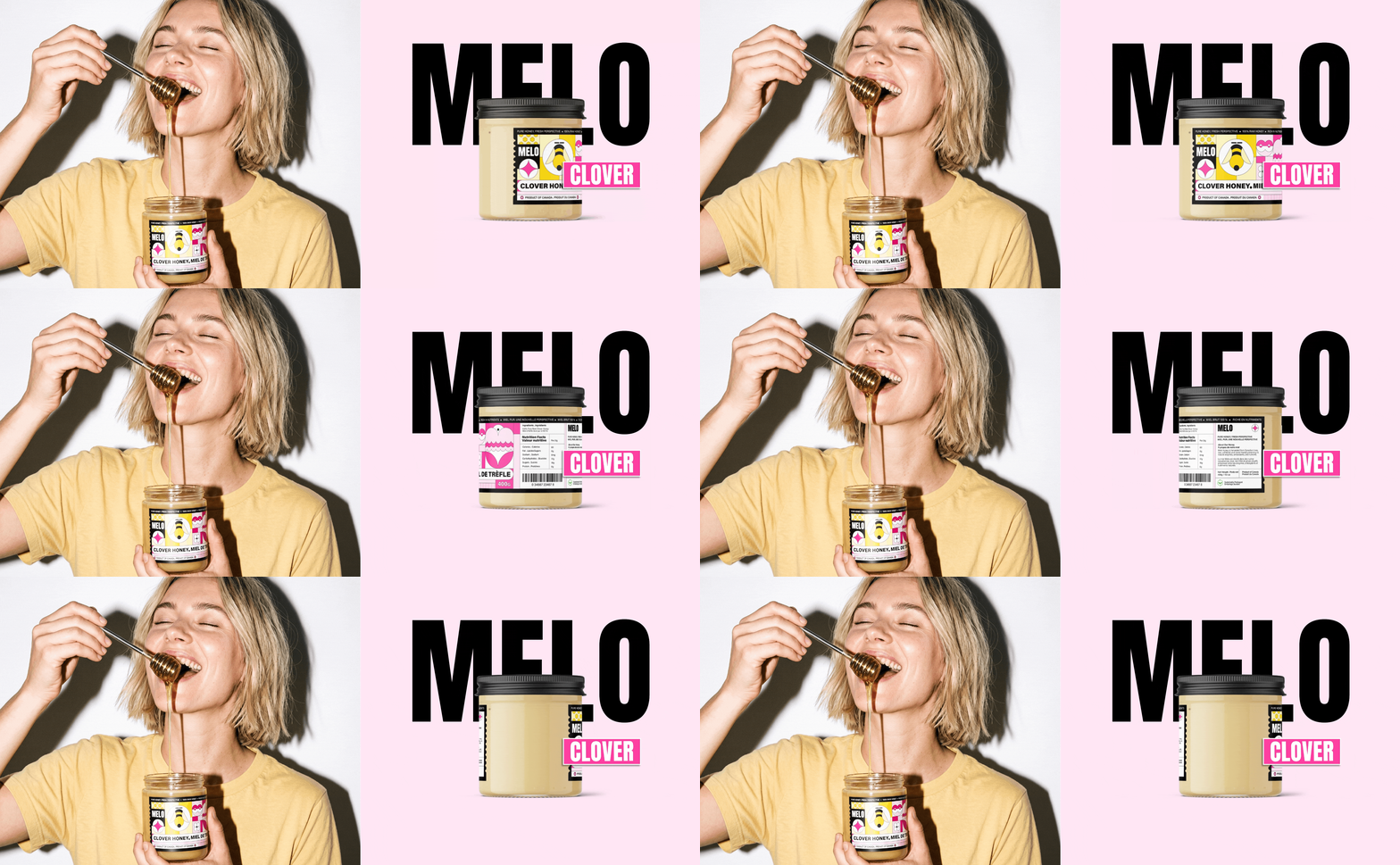
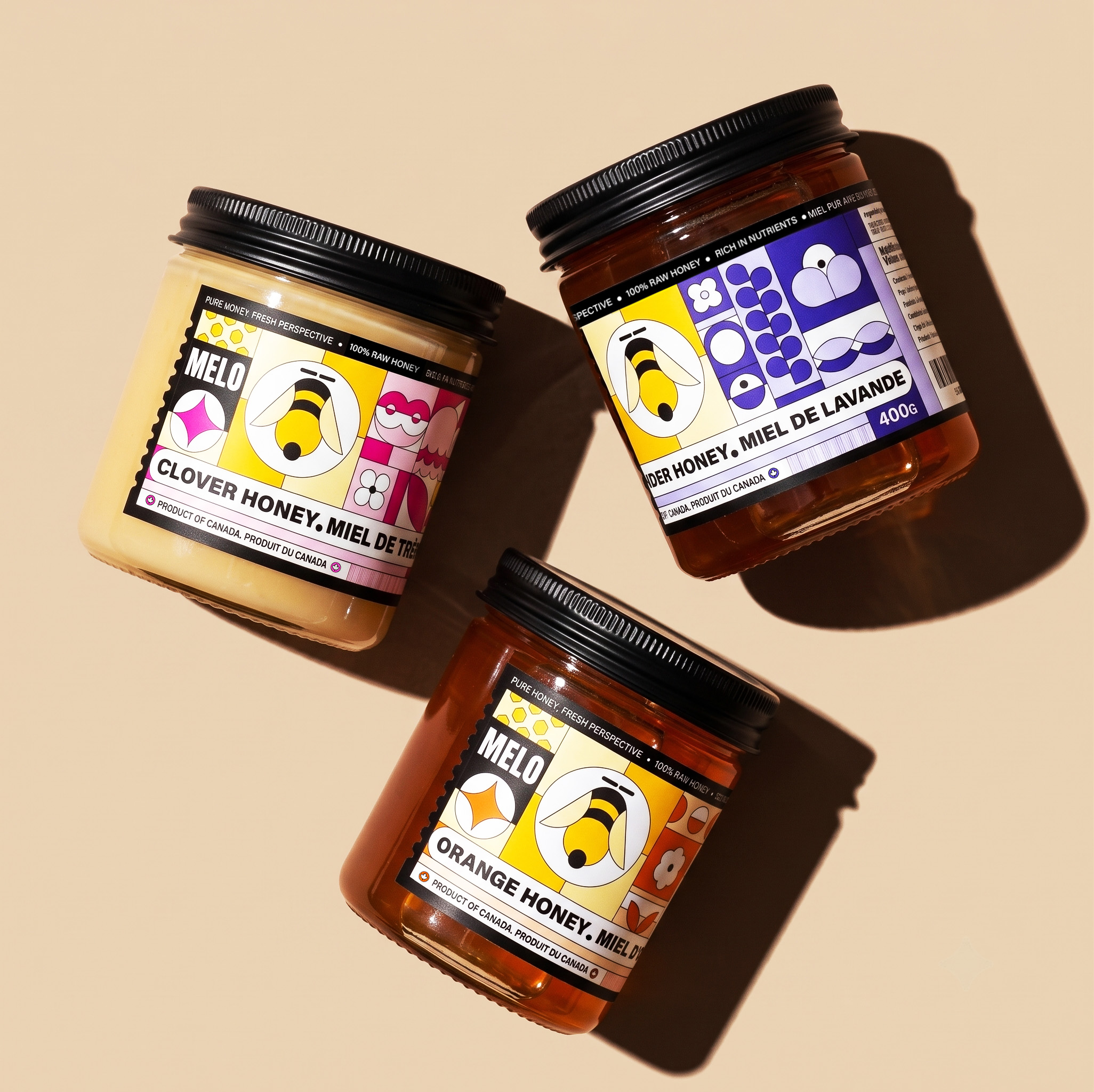
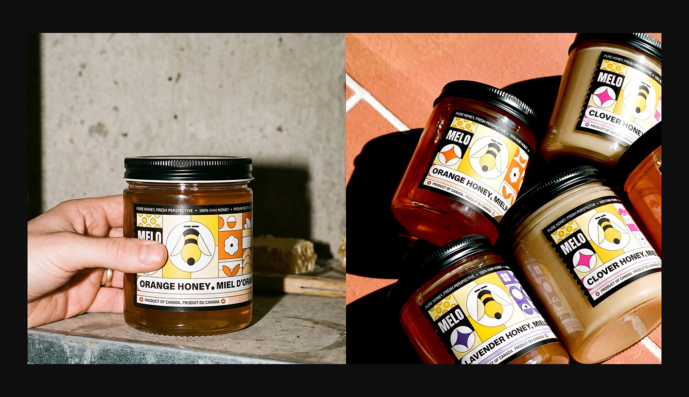
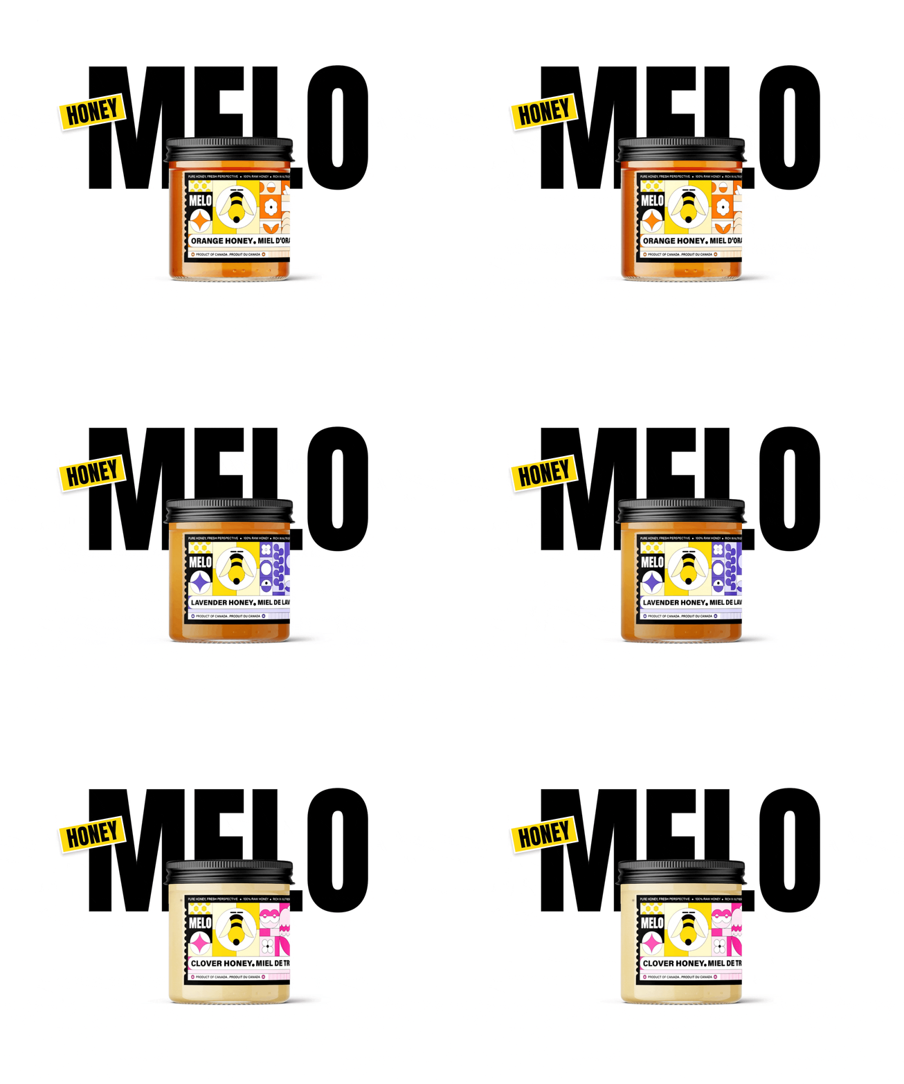
Most honey brands rely on traditional packaging that primarily appeals to older consumers, limiting their relevance among younger audiences. Melo was created to redefine honey as a modern lifestyle product, moving beyond conventional retail packaging through bold illustrations, expressive typography, vibrant colours, and contemporary design. The result is a distinctive brand identity that makes honey feel fresh, engaging, and relevant to a new generation of consumers.

PROCESS.
Research into the honey category showed that many brands use similar packaging styles, often featuring muted colours, rustic visuals, and traditional typography. This created an opportunity to develop a brand that feels more modern and appealing to younger consumers.
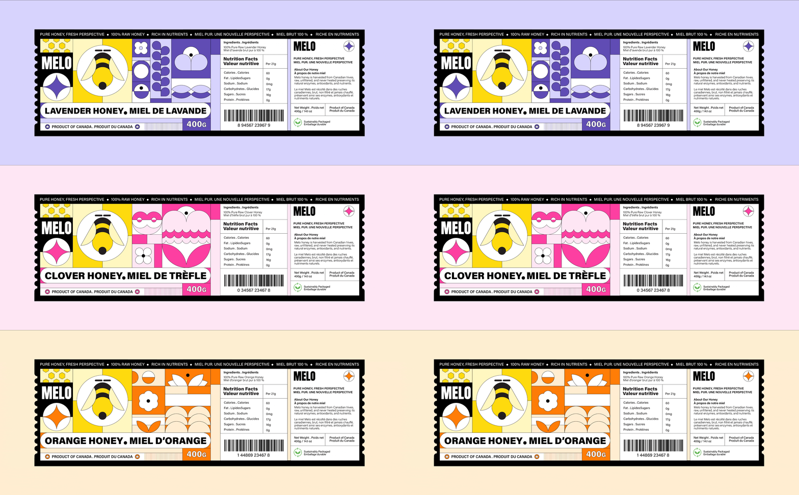
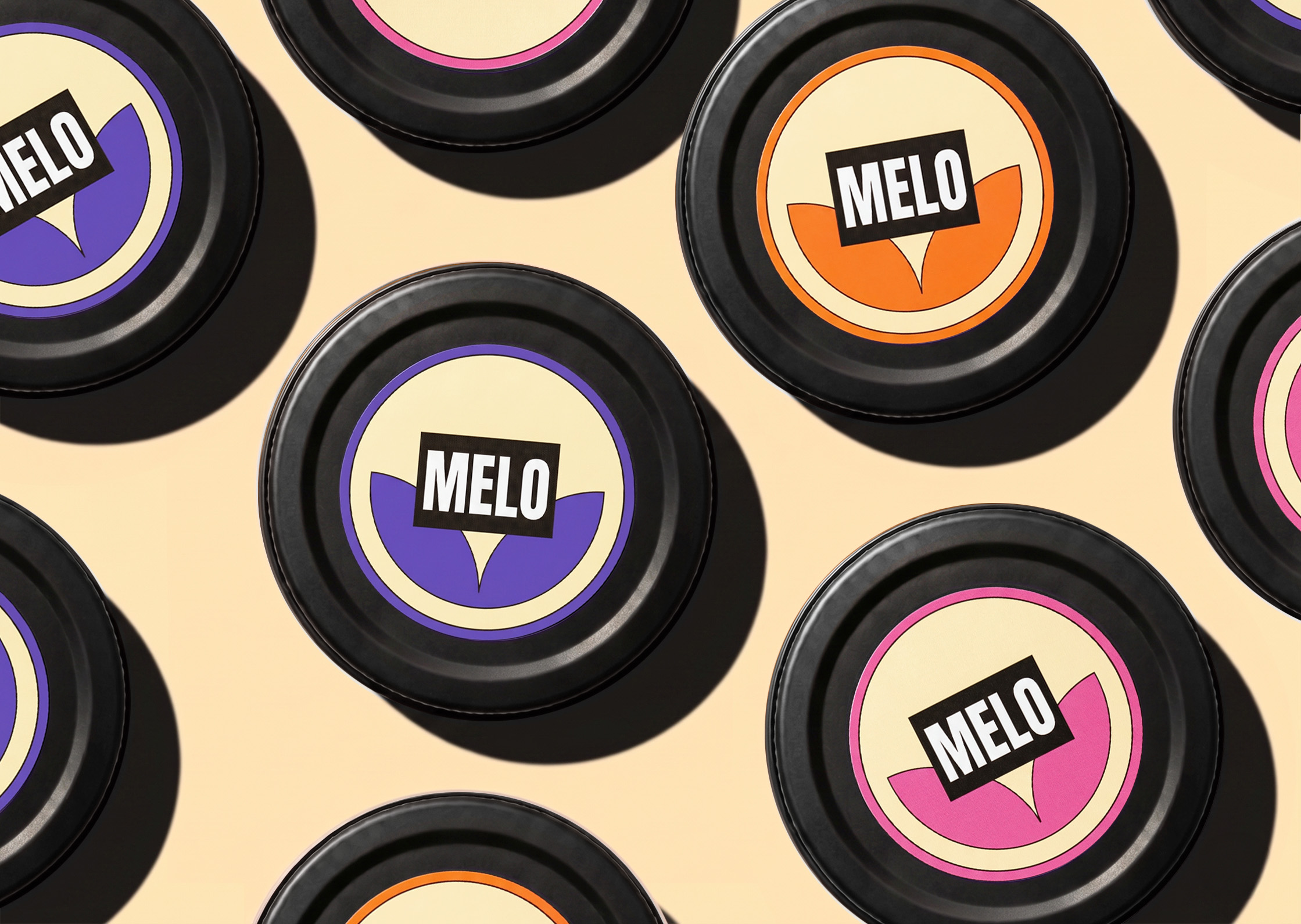
Based on these insights, I explored visual directions inspired by the colours and shapes of honey-producing flowers. Through mood boards and concept development, I created a visual system that combines geometric illustrations, bold typography, and vibrant colours to help the product stand out on the shelf.
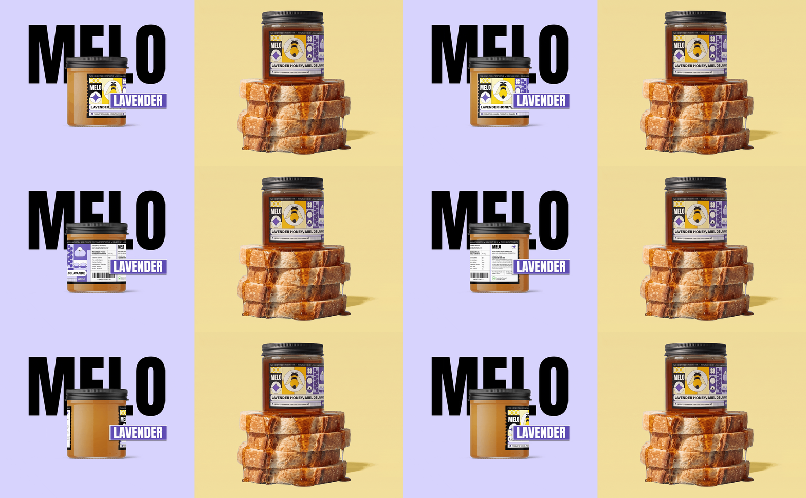
The final design presents raw honey in a fresh and engaging way, balancing its natural qualities with a contemporary look that feels distinctive, approachable, and relevant to a new generation of consumers.